

Viv Harries is the Founder of Vivi Creative. He works with businesses to give them the creative edge with unique designs and a solid brand identity.
recent posts
- How a Strong Brand Can Help Welsh Startups Stand Out
- Top 10 Logo Design Mistakes (and How to Avoid Them)
- Web Design Trends of 2025: What’s In, What’s Surprising, and What Actually Works
- Design Trends for 2025
- Maximising Your ROI with Meta and Google Ads in 2025: Best Practices and Our Proven Process
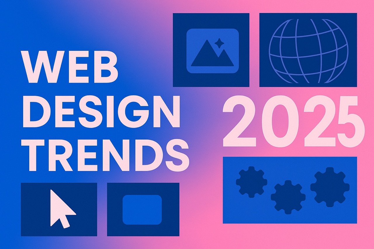
Web Design Trends of 2025: What’s In, What’s Surprising, and What Actually Works
The world of web design never sits still—and 2025 is proving to be another exciting chapter in how we experience the internet. As we settle into this new year, it's clear that the latest web design trends aren't just aesthetic changes; they reflect deeper shifts in how we use and relate to digital spaces.
At VIVI, we’ve taken a step back to look at the trends popping up across the web. Some of them are expected. Others? Let’s just say we wouldn’t have guessed they’d make it into the spotlight. But here they are, shaking up the design scene.
Before we dive into these trends, let’s pause for a second and ask the question:
Should You Jump on Every Web Design Trend?
Web design trends are like shiny new toys—they’re fun to explore. But not every trend will serve your goals or your users. Just because something is popular doesn’t mean it belongs on your site.
Always start with the end in mind. Ask yourself: What’s the one thing I want a visitor to do when they land on my site? Whether that’s booking a call, buying a product, or signing up for a newsletter, design decisions should guide users toward that outcome.
If a trend supports your goal and improves the user experience—go for it. If not, admire it from afar.
Alright, let’s dig into the top web design trends we’re seeing in 2025, reordered to reflect their impact and frequency.
1. Micro Interactions: The Subtle Details That Hook Users
In the past, big, bold animations ruled the day. But now, it’s the quiet, deliberate touches that are stealing the show.
Micro interactions are those small, often unnoticed movements that respond to user behavior—a button changing color on hover, a border that subtly animates, or a card that gently tilts when scrolled into view. They're not flashy, but they create a sense of responsiveness and polish that makes a site feel alive.
Why are micro interactions trending? Because attention spans are shrinking, and grabbing focus with small moments of delight keeps users on your site longer. These nuanced design choices encourage engagement without overwhelming the viewer.
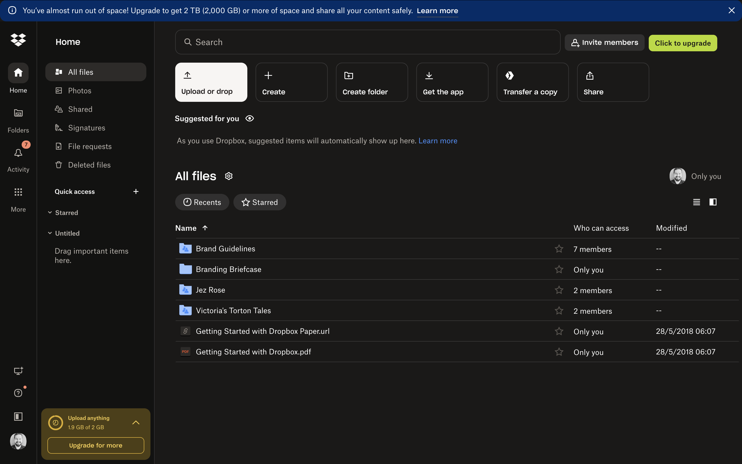
Example: Dropbox
Dropbox utilises micro interactions such as progress bars during file uploads, providing users with immediate feedback and enhancing the overall user experience.
2. Bright, Bold, and Unapologetic
Bright, saturated colours and oversized typography are dominating web pages this year. Designers are embracing high-contrast visuals, loud palettes (lime green is everywhere), and huge, heavy type.
This trend feels like a rebellion against the minimalism of the past decade and the mobile-first restrictions that often limit creativity. Now, instead of designing for mobile first, designers are ensuring mobile works—but letting desktop breathe a little more.
Expect to see full-viewport headlines, chunky black text, and color schemes that feel more like branding statements than background choices. This trend grabs attention—and refuses to let go.
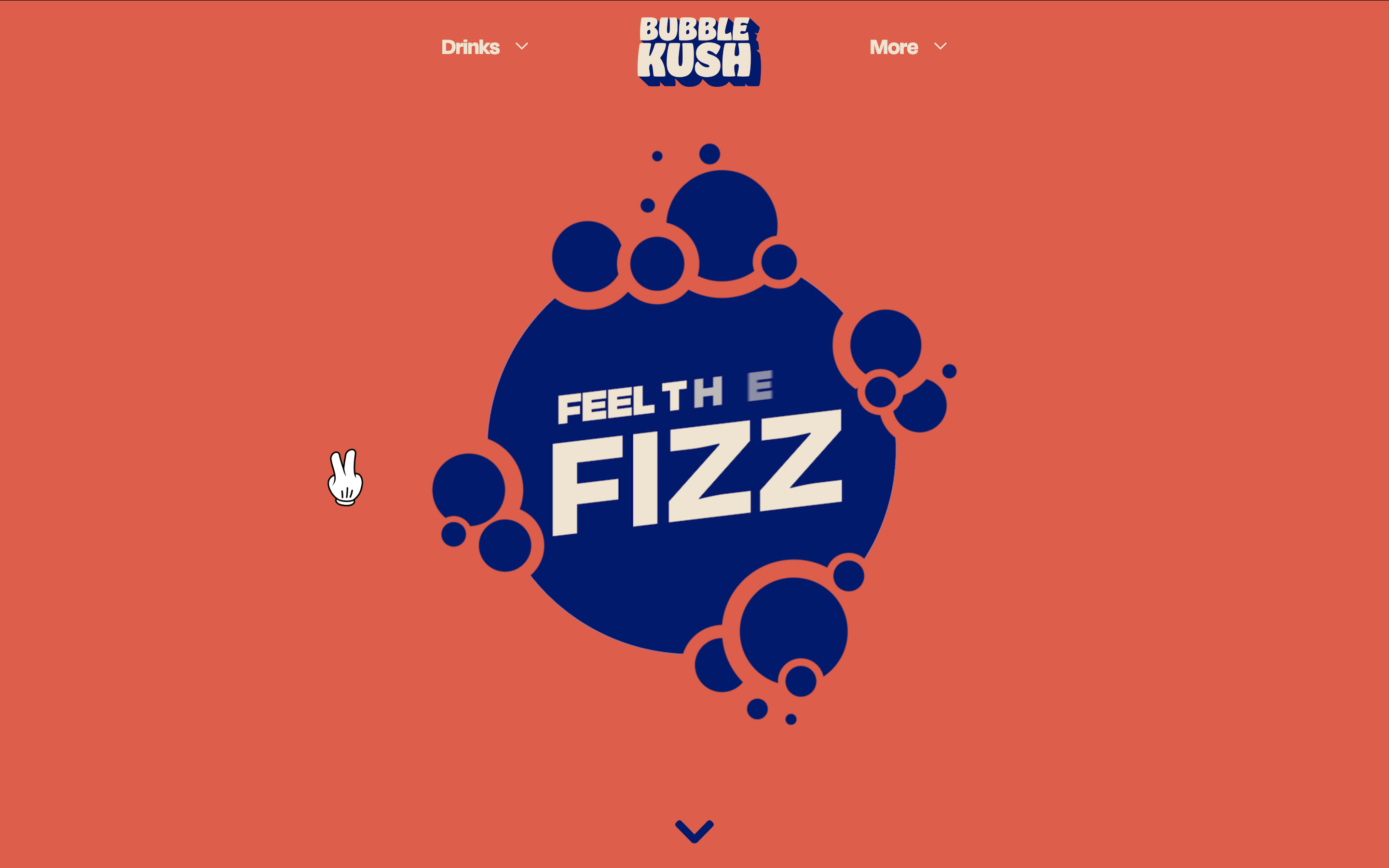
Example: BUBBLE KUSH
The BUBBLE KUSH website employs bold colors and large typography to create an impactful visual experience that captures user attention.
3. Imperfections: A Rebellion Against AI Polished Design
With AI-generated content becoming the norm, many designers are going in the opposite direction—making things look imperfect on purpose.
Hand-drawn icons, scribbly lines, rough edges, and asymmetrical layouts are all over the web. These choices make things feel human. They stand in contrast to the sterile, overly clean look that often signals an AI-generated visual.
Imperfection is a statement now. It says, This was made by a real person.
That doesn’t mean it’s sloppy. In fact, the best examples of this trend are intentional and thoughtful—designed to feel raw without being careless. Think of it as controlled chaos.
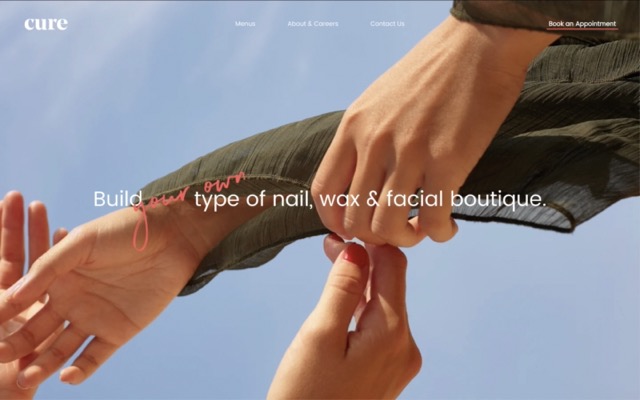
Example: Cure Nails
Cure Nails incorporates hand-drawn illustrations and organic shapes, adding a personal and authentic touch to their website design.
4. Scrollytelling: Narratives That Move With You
We’ve all heard how important storytelling is in branding and marketing. Now, that principle is showing up in design in a big way with scrollytelling.
This trend uses scrolling as a storytelling device. As users move down (or across) a page, elements shift, animate, or transform to tell a visual and narrative story. It's part comic book, part interactive slideshow.
Used well, scrollytelling helps guide users through complex ideas or emotional journeys. It’s popular in media and editorial websites but is creeping into product and brand sites too.
Just remember: this kind of experience takes planning. You’re not just designing a page—you’re choreographing a journey.
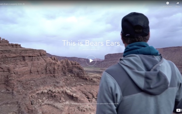
Example: Patagonia's "This Is Bears Ears"
Patagonia's "This Is Bears Ears" page uses scrollytelling to narrate the story of Bears Ears National Monument, combining text, images, and videos that unfold as users scroll.
5. Back & Forth, Left & Right—Not Just Up & Down
For years, web navigation followed the same basic rule: scroll up and down. But in 2025, designers are challenging that norm and embracing multi-directional navigation.
Think sideways scrolling, section-based navigation, and layered content. These layouts feel more like immersive environments than pages. It’s like walking through a house instead of reading a brochure.
This kind of experience works especially well for portfolios, creative studios, or product launches where you want to slow the user down and encourage exploration. Just be sure to balance creativity with clarity—users still need to understand where they are and where to go next.
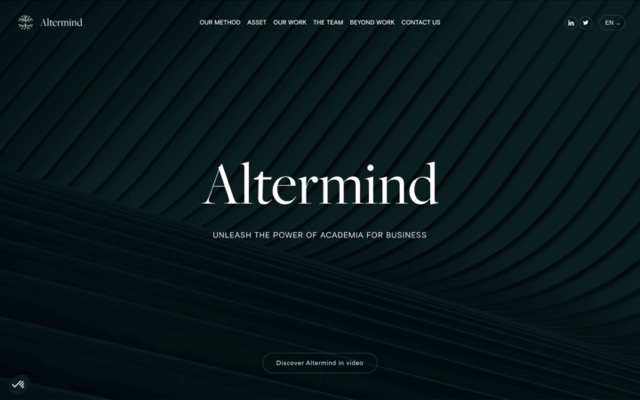
Example: Altermind
Altermind's website features multi-directional navigation, allowing users to explore content both horizontally and vertically, creating an immersive browsing experience.
6. Text-Heavy Layouts: The Wall of Words Strikes Back
For years, clients have asked, “Is this too much text?” But 2025 is saying, “Actually, give us more.”
Designers are embracing text-heavy layouts—often using large fonts and strategic formatting to make content more engaging. The idea is that a block of well-styled text actually slows users down and draws attention, instead of causing them to bounce.
Pattern-breaking is key here. By mixing up image placement, adjusting rhythm, and playing with spacing, designers are turning dense content into eye-catching focal points.
Pro tip: If you go big on text, make sure it’s legible. Tiny type + long paragraphs = instant scroll-past.
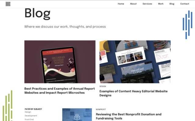
Example: New Media Campaigns Blog
New Media Campaigns showcases content-heavy editorial designs that are well-structured, making extensive text engaging and easy to navigate.
7. Cursor Alternatives: Your Mouse, But Make It Fun
Remember MySpace cursors? They’re back—with a glow-up.
Designers are playing with custom cursors again, replacing the default pointer with floating orbs, shapes, outlines, or animations. Some are subtle and follow the cursor gently; others are intentionally weird and attention-grabbing.
The best use cases feel intentional—adding a little flair to match the brand. The worst? Distracting novelties that interfere with usability.
If you’re going to experiment with this, test it. What feels cool on desktop might be unusable on smaller screens or for those with accessibility needs.
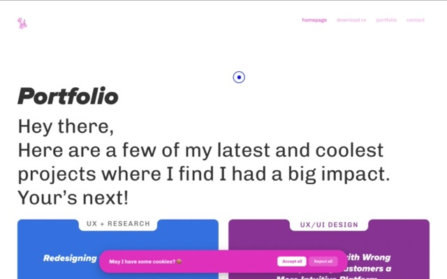
Example: Roger Junior Portfolio
Roger Junior's portfolio website features custom cursor designs that enhance the interactive experience, reflecting the designer's unique style.
8. Sound: Yep, It’s Back
This one surprised us too—sound is sneaking back into web design.
But don’t worry, it’s not the autoplay background music from 2003. Today’s sound design is more refined: subtle sound effects when clicking, ambient audio you opt into, or interactive cues that support storytelling.
When used well, sound can enhance mood and immersion. But it has to be opt-in, and controls must be obvious. Otherwise, it becomes annoying fast.
Use with care—and consider your audience. Sound may not be the right fit for every brand or experience.
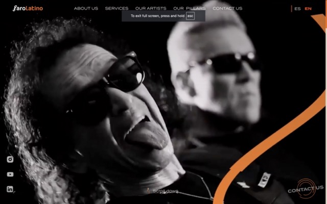
Example: FaroLatino Entertainment
FaroLatino's website integrates background music and sound effects, creating an immersive audiovisual experience for visitors.
9. Anti-Usability: The Punk Rock of Web Design
Now for one of the more controversial trends of 2025: anti-usability.
This isn’t about making things hard on purpose—it’s about pushing back on rigid UX rules that have made websites predictable, formulaic, and, well, boring.
Some designers are intentionally breaking conventions: hiding navigation, breaking grid systems, or placing buttons in unexpected places. It's a little chaotic, a little rebellious—and a lot risky.
But sometimes that’s the point. It grabs attention. It challenges assumptions. It makes users think—and in doing so, it makes them remember.
That said, don't ditch usability entirely. Great UX is still the foundation of a successful website. But shaking things up once in a while? That’s how innovation happens.
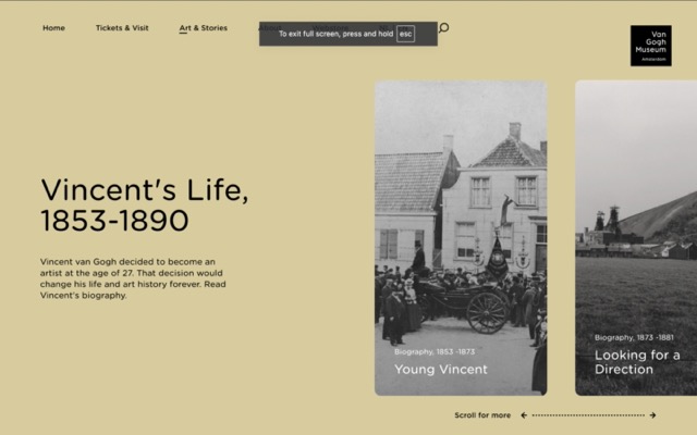
Example: The Life of Van Gogh
This storytelling website about Van Gogh's life uses unconventional navigation and design elements, challenging traditional usability norms to create a unique user experience.
Use Trends Strategically, Not Just Stylishly
The web design trends of 2025 are exciting, bold, and a little weird—in the best possible way.
They reflect a push-and-pull between what’s familiar and what’s fresh. Some trends embrace human flaws. Others lean into technology. Some prioritise clarity. Others crave chaos. Together, they paint a picture of a digital world that’s alive, evolving, and increasingly personalised.
But here’s the real takeaway:
Don’t chase every trend. Instead, focus on your users and your goals. Let your website reflect your story, and use trends as tools—not templates.
The best websites in 2025 won’t be the ones that follow trends the most. They’ll be the ones that express who they are with confidence and clarity.
So yes, explore the new, the shiny, the strange. But always come back to this: Be strategic. Be authentic. And let your website work for you—not just look good on someone else’s trend list.
Thanks for reading
related posts

about the author

about the author
Viv Harries is the Founder of Vivi Creative. He works with businesses to give them the creative edge with unique designs and a solid brand identity.