

Viv Harries is the Founder of Vivi Creative. He works with businesses to give them the creative edge with unique designs and a solid brand identity.
recent posts
- How a Strong Brand Can Help Welsh Startups Stand Out
- Top 10 Logo Design Mistakes (and How to Avoid Them)
- Web Design Trends of 2025: What’s In, What’s Surprising, and What Actually Works
- Design Trends for 2025
- Maximising Your ROI with Meta and Google Ads in 2025: Best Practices and Our Proven Process
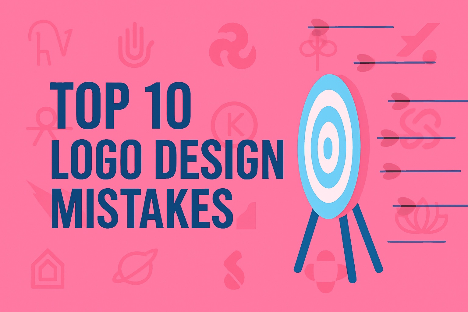
Top 10 Logo Design Mistakes (and How to Avoid Them)
Avoid the pitfalls and create a brand identity that actually works.
At VIVI Creative, we’ve seen it all – from pixelated DIY logos to overcomplicated branding that confuses more than it converts. A logo is often the first thing people notice about your business, so getting it right matters. Whether you’re launching a new venture or thinking about a rebrand, here are the top 10 logo design mistakes we see (and how to sidestep them like a pro).
1. Overcomplicating the Design
❌ The Mistake:
Trying to cram too many elements, colours, or concepts into one logo.
???? Why It’s a Problem:
Complex logos don’t scale well, are hard to recognise, and look messy on mobile devices or social media.
✅ How to Avoid It:
Keep it simple and memorable. Think of the Nike swoosh — it’s just a single curved line, but it’s iconic.
2. Following Trends Too Closely
❌ The Mistake:
Designing a logo purely based on current trends (like gradients, thin lines, or quirky fonts).
???? Why It’s a Problem:
Trends come and go. You want your logo to last 5–10 years, minimum.
✅ How to Avoid It:
Focus on timeless design principles — balance, clarity, and relevance. Airbnb’s 2014 rebrand received backlash at first but has aged incredibly well because it focused on brand meaning, not just style.
3. Using the Wrong Font
❌ The Mistake:
Picking a font that’s either too generic (like Arial or Times New Roman) or unreadable (super decorative fonts).
???? Why It’s a Problem:
Typography sets the tone. A font can say “professional” or “party supplies” — you need the right vibe.
✅ How to Avoid It:
Choose a font that matches your brand personality. For example, Mailchimp’s logo uses a friendly script font that suits their informal, accessible tone.
4. Copying Other Brands
❌ The Mistake:
Making your logo look too similar to a popular brand — intentionally or not.
???? Why It’s a Problem:
It confuses customers and weakens your own identity. Worse, you could face legal issues.
✅ How to Avoid It:
Do competitor research, then go in the opposite direction. Be inspired, but don’t imitate.
✏️ Example: A client once came to us with a logo nearly identical to Beats by Dre. We reworked it to reflect their own values, creating something more personal and unique.
5. Ignoring Scalability
❌ The Mistake:
Designing a logo that looks great on a billboard but terrible as an Instagram profile pic.
???? Why It’s a Problem:
Logos must work across different mediums — from business cards to websites and social media.
✅ How to Avoid It:
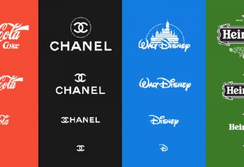
Design with scalability in mind. Test it at small sizes. Brands like Twitter or Spotify have super clear icons that work at any size.
6. Choosing Poor Colour Combinations
❌ The Mistake:
Picking clashing colours, too many hues, or colours that don’t align with the brand.
???? Why It’s a Problem:
Colours influence perception and emotion. Plus, bad colour choices can hurt readability.
✅ How to Avoid It:
Stick to 2–3 well-matched colours and consider colour psychology. For instance, Slack’s original logo was colourful but too chaotic. Their rebrand simplified and aligned colours for a stronger impact.
7. Not Thinking About Versatility
❌ The Mistake:
Having a logo that only works in colour, or doesn’t look good on dark/light backgrounds.
???? Why It’s a Problem:
Logos need to work in black & white, reverse (white on dark), and one-colour versions.
✅ How to Avoid It:
Create a logo system: primary, secondary, icon-only, black & white, and favicon versions. Look at Apple’s logo — iconic in any format.
8. Using Stock Icons or Clip Art
❌ The Mistake:
Relying on generic graphics from Canva or stock sites.
???? Why It’s a Problem:
Stock images aren’t unique and don’t build brand equity. Your logo won’t stand out.
✅ How to Avoid It:
Invest in a custom design that reflects your values, mission, and audience. A unique mark builds long-term recognition.
9. Designing Without a Brand Strategy
❌ The Mistake:
Jumping straight into logo design without knowing your audience, values, or market position.
???? Why It’s a Problem:
The logo becomes an aesthetic exercise rather than a business asset.
✅ How to Avoid It:
Start with strategy. Who are you? Who are you talking to? Why do you matter? This is how we approach every project at VIVI Creative — design with purpose.
10. Forgetting About File Formats and Usage
❌ The Mistake:
Getting a logo that’s only delivered as a JPEG or one that's not usable for print or digital.
???? Why It’s a Problem:
You’ll struggle when you need to scale it, print it, or place it on a website.
✅ How to Avoid It:
Always get your logo in multiple formats:
Vector (SVG, EPS) for print and scaling
PNG with transparency
JPEG for general use
Favicon for websites
We deliver all these (and more) in our logo packages.
Your logo is more than just a graphic — it’s your handshake, your first impression, your digital storefront. Avoiding these common mistakes puts your brand in a strong position from the very beginning.
At VIVI Creative, we help Welsh businesses build logos that are clear, clever, and completely custom. Ready to level up your branding?
Let’s chat about your logo, thanks for reading.
related posts

about the author

about the author
Viv Harries is the Founder of Vivi Creative. He works with businesses to give them the creative edge with unique designs and a solid brand identity.