Viv Harries is the Founder of Vivi Creative. He works with businesses to give them the creative edge with unique designs and a solid brand identity.
recent posts
- How a Strong Brand Can Help Welsh Startups Stand Out
- Top 10 Logo Design Mistakes (and How to Avoid Them)
- Web Design Trends of 2025: What’s In, What’s Surprising, and What Actually Works
- Design Trends for 2025
- Maximising Your ROI with Meta and Google Ads in 2025: Best Practices and Our Proven Process
The Art of Web Design: what makes good and bad design.
Your website is often the first port of call for any business or person looking to use your services or buy your product. It's the virtual handshake that can either make a compelling first impression or leave potential customers searching for the exit button. In this era of heightened digital competition, the art of web design holds the key to success, offering the potential to engage visitors, convert them into loyal customers, and ultimately contribute to the growth of your business.
Web design, like any art form, consists of a delicate balance between creativity and functionality. When executed well, it's a symphony of user-centricity, aesthetics, and technical prowess that leads to a harmonious online experience. Conversely, a poorly designed website can be an obstacle and course of frustration, deterring visitors and potentially losing their custom.
In this blog post VIVI Creative will look at the do's and don'ts of web design and we talk about some tips for how you can make your website give you an ROI and turn visitors into loyal customers.
The DNA of Effective Web Design
User-Centric Focus
The foundation of a thriving website lies in catering to the needs of its users. A seamless and intuitive navigation system guides visitors through the site effortlessly. A stellar example of user-centric design can be observed on Airbnb's platform. The site's interface is uncluttered, the search functionality is prominently placed, and the booking process is streamlined for maximum ease.
The Responsive Imperative
In the age of mobile browsing, a responsive design is not just a luxury; it's a necessity. Google's mobile-friendly test is a reliable tool for ensuring that your website is adaptable across a range of devices, ensuring a consistent and satisfactory user experience.
Aesthetic Allure
A website's visual aesthetics should resonate with its brand identity and target audience. Apple's website stands as a testament to this principle, employing a clean and minimalist design that beautifully showcases their premium products.
Call-to-Actions (CTAs)
Effective CTAs are the signposts that guide users toward desired actions. An exceptional case study of CTAs is exhibited on Amazon's homepage. Prominent buttons beckon users to explore products, delve into special offers, and engage through sign-in prompts.
Swift Loading Speed
In a world characterised by impatience, a sluggish website can turn away potential customers. Employ tools like Google's PageSpeed Insights to analyse and optimise loading speeds, ensuring a frictionless browsing experience.
Navigating Poor Web Design
Interface Overload
Websites drowning in excessive text, images, and design elements baffle and overwhelm users. Instances where pop-ups and advertisements obstruct content lead to frustrating user experiences.
Neglecting Responsiveness
Failure to optimise a website for mobile usage alienates a significant proportion of potential visitors. A non-responsive site not only appears unprofessional but also makes navigation on small screens cumbersome.
Distracting Animations
Animations, when used judiciously, can enhance engagement. However, excessive or flashy animations that serve no meaningful purpose can detract from the website's primary message or products.
Colour and Typography
The selection of harmonious colours and legible typography contributes to a pleasing user experience. Steering clear of jarring colour combinations and illegible fonts is paramount.
Ignoring SEO
Disregarding search engine optimisation (SEO) is akin to relegating your website to the shadows of the digital realm. Incorporate strategic keywords, craft compelling meta descriptions, and diligently employ alt tags to enhance visibility and searchability.
How to Craft a Winning Digital Presence
Audience Insight
Delve into comprehensive research to understand your target audience's preferences, behaviours, and needs. This insight will serve as the compass guiding your website design choices.
Simplified Navigation
A clear and concise menu structure serves as a roadmap for users, facilitating effortless exploration of your website's content.
Content Prowess
In the digital landscape, content reigns supreme. Offer substantial, relevant, and captivating content that entices visitors to return for more, simultaneously enhancing your website's search engine ranking.
Iterate and Elevate
Regularly analyse your website's performance using tools such as Google Analytics. Employ insights to fine-tune your design, address issues, and augment user engagement.
Professional Expertise
If web design lies outside your expertise, consider enlisting the aid of professional designers or web design agencies. Their mastery can bridge the gap between your brand vision and an effective online presence.
Examples of Good Web Design
Apple's website is a prime example of minimalist and visually appealing design. The layout is clean, images are high-quality, and the focus remains on the products.
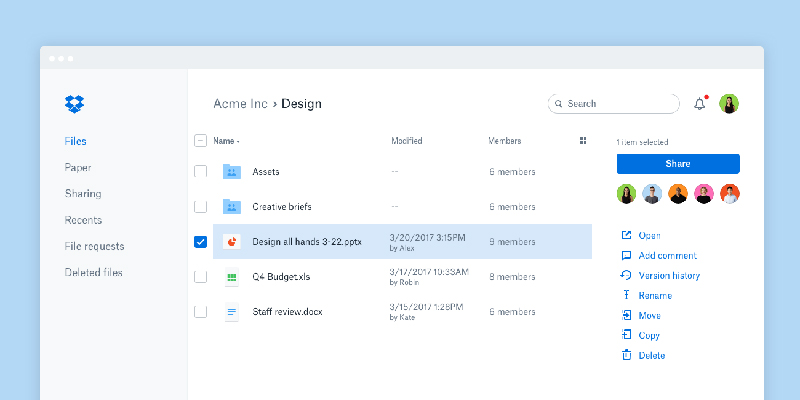
Dropbox's website demonstrates effective use of colour, typography, and whitespace. The messaging is clear, and the interface is intuitive.
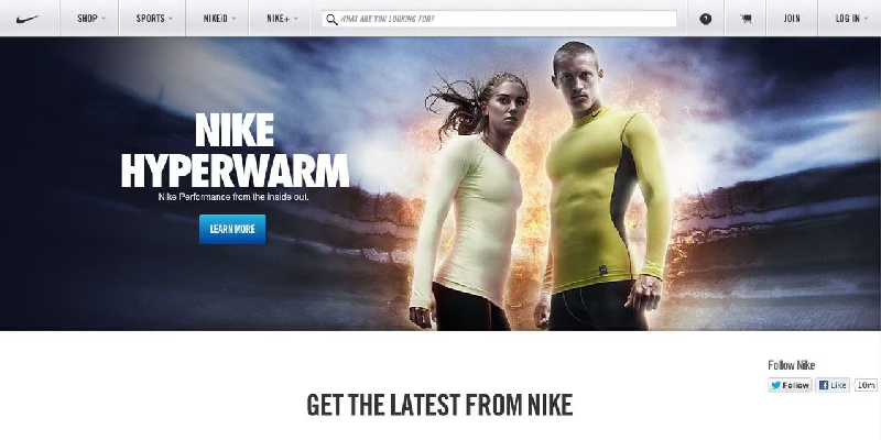
Nike's website showcases a dynamic design with interactive elements. It effectively uses video content and large visuals to engage users.
Examples of Bad Web Design

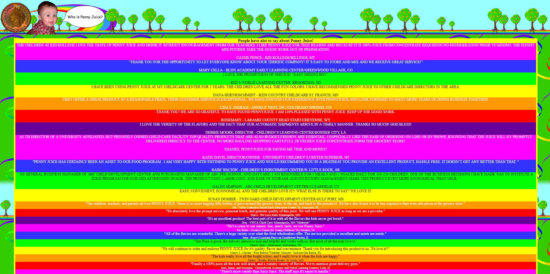
The original Space Jam movie's website from 1996 is a classic example of early web design. It's cluttered, chaotic, and difficult to navigate by modern standards.
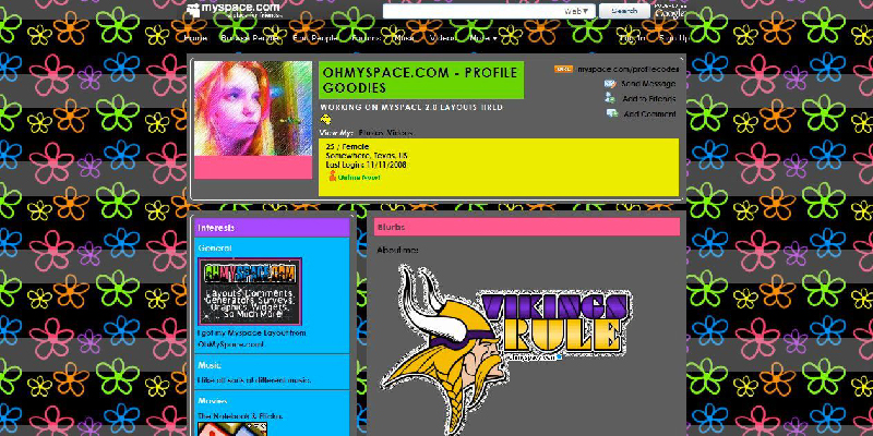
While Myspace was a popular social networking site in the past, its design was cluttered with too many customisation options, leading to inconsistent and visually overwhelming profiles.
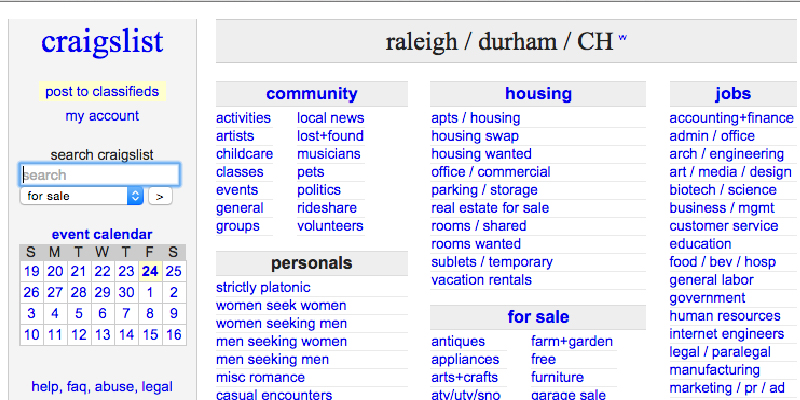
While functional, Craigslist's design is notably outdated and lacks visual appeal. The text-heavy layout and basic design elements could benefit from a modern update.
In these examples, the good web designs exhibit clean layouts, clear messaging, visual appeal, and user-centric navigation. On the other hand, the bad web designs showcase cluttered interfaces, outdated aesthetics, and poor user experience. These examples highlight the importance of adhering to modern design principles to create websites that effectively engage users and convey a professional image.
A website isn't just a digital presence – it's a dynamic entity that can either propel your business toward success or hold it back. The journey from good to bad web design isn't a one-way street; it's a continuous evolution that demands constant attention and adaptation.
By embracing user-centricity, you lay the foundation for a website that resonates with your audience's needs and desires. A responsive design ensures that your content shines on any screen, from the smallest smartphone to the largest desktop monitor. Compelling visuals and seamless navigation not only engage visitors but also guide them toward meaningful interactions that can translate into tangible results.
On the flip side, the hallmarks of bad design – cluttered interfaces, ignored responsiveness, and unclear calls-to-action – can drive potential customers away faster than they arrived. Learning from the missteps of poorly designed websites, we recognise the importance of striking a balance between innovation and usability.
Your website isn't a static entity; it's a living, breathing representation of your brand that deserves continuous attention and care. Regularly assess its performance, listen to user feedback, and adapt to changing trends and technologies.
If you want to find out how VIVI Creative can help you with developing your current website, then please don't hesitate to get in touch.
Thanks for reading.
